C R E A T I V E
D I R E C T I O N
THE POWER OF NEW
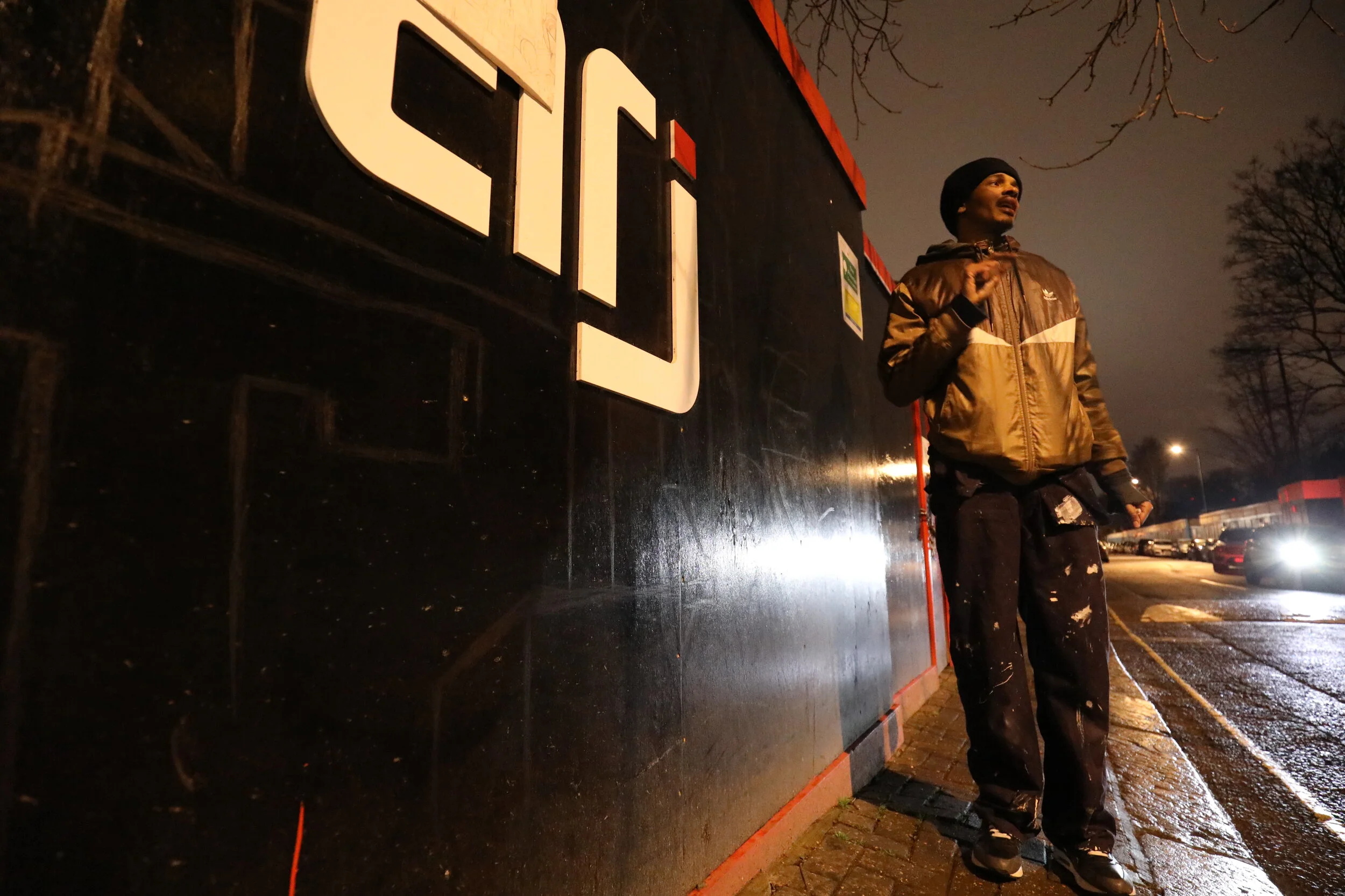
Commissioned by construction company ARJ in collaboration with Westminster City Council came the birth of the mural installation titled ‘ The Power of New’. Produced in late 2017, This project was inspired by the love for street art, typography and architecture, with the title and letterform composition spelling the words “The Power of New’. As an opportunity for creativity this work was thoroughly enjoyed and appreciated by myself and community alike with its fair share of hand callouses, cold nights, caps and onlooking curiosity.
As a partial tribute to late friends Joel ‘Jullz’ Jordan Prendegrast and fellow graffiti artist Jan ‘Aset’ Francis this production was mainly a creative expression to represent the erection of the new school extension its medium was covering. Using my inspiration from a multitude of sources including letterform, multiplicity, graffiti and urban environments, this was the direction i chose to follow when creating this outcome.
……………HENDRIXX 18
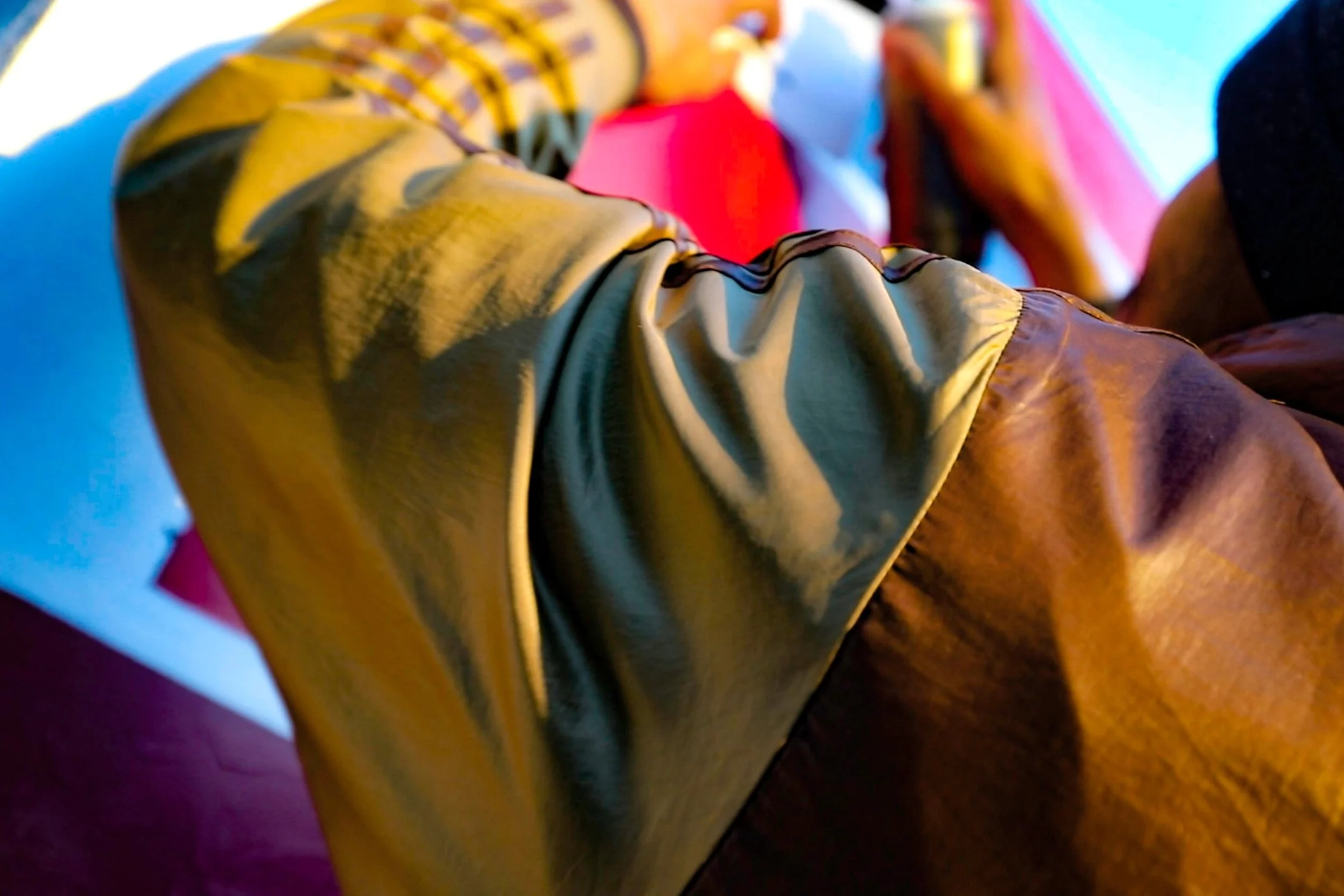
Initially a produced as memorabilia for a clients birthday event, this project presented itself as an opportunity to be a motion picture , shooting a video which summarised highlights of the event. Titled ‘Hendrixx18’ this shoot was a new experience for me to explore as the scenery and setting presented various changes in lighting and camera exposure, most of which worked perfectly in creating a strobe-light-esque effect and exaggerating shadows and blur.
MOTIONS OF YOUR MIND
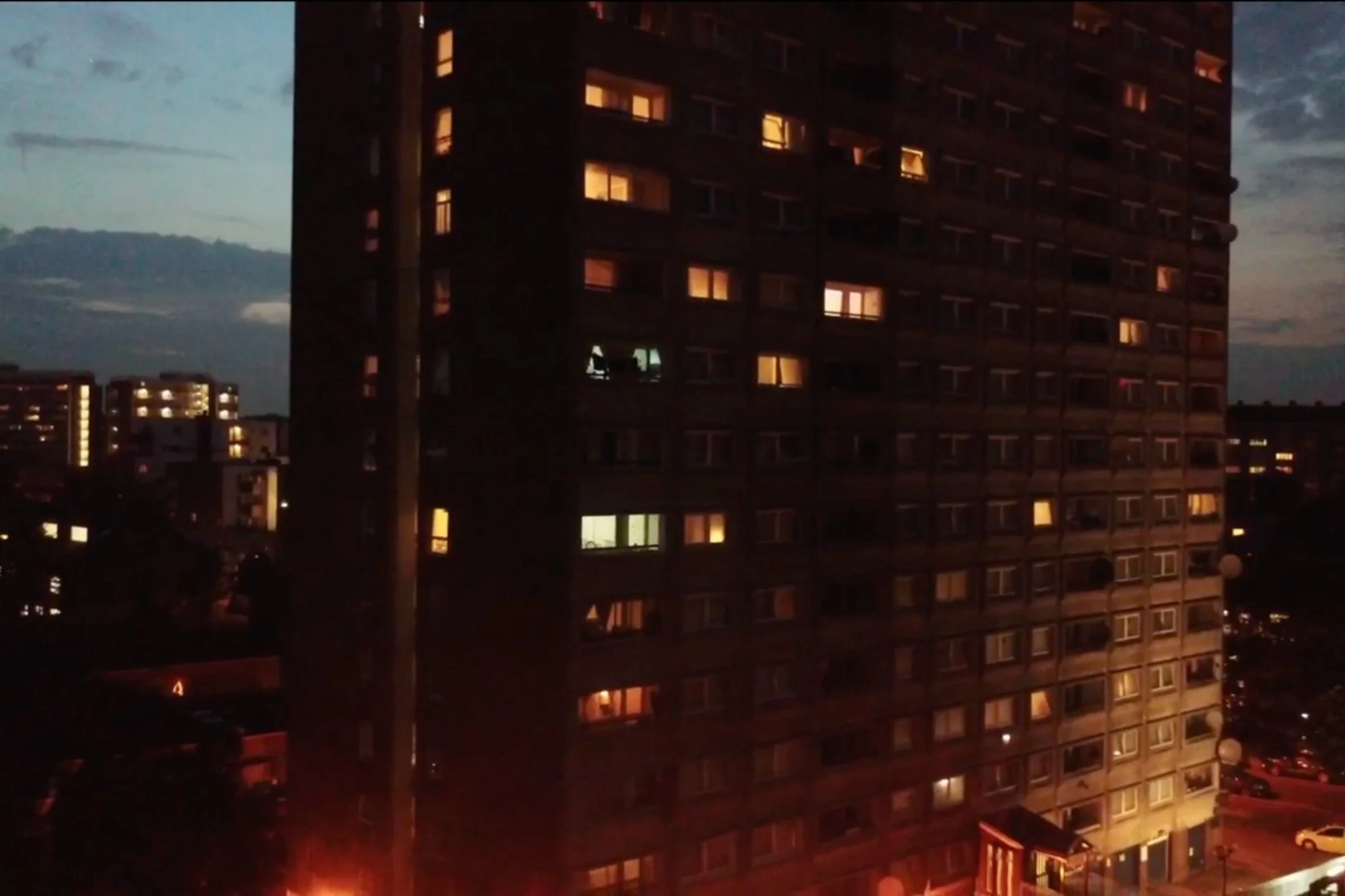
Part of an ongoing initiative, this project titled ‘Motions of your Mind’ is a series of motion pictures & montages which capture scenery often seen and experienced during travel. At random selection these clips tell a story the way I would like the viewer to see in addition to giving an insight on my creative approach when capturing and displaying footage of any sort, only in this case using my immediate environment as the subject.
This ongoing project thus far has also allowed me to experiment greatly on a range of filming and editing techniques and VFX methods I now implement on content and work for clients. Through this it also allowed me to forge a style of filming and editing that reflects my hand crafted artwork being the glitched, raw, rugged and collaged pieces I often produce with the inclusion of graphics, something which some clients have grown to appreciate and like.
THIS IS THE FUTURE
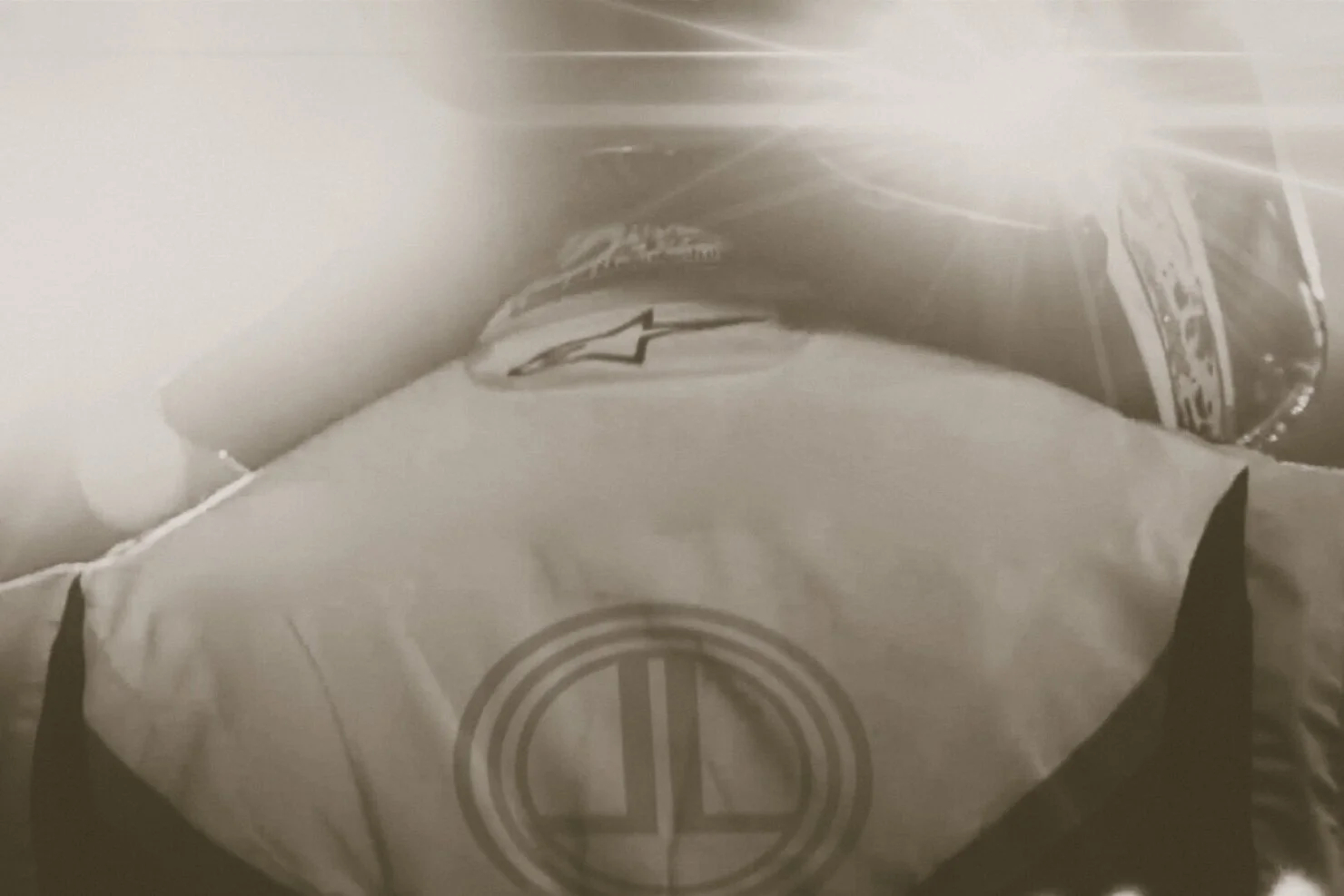
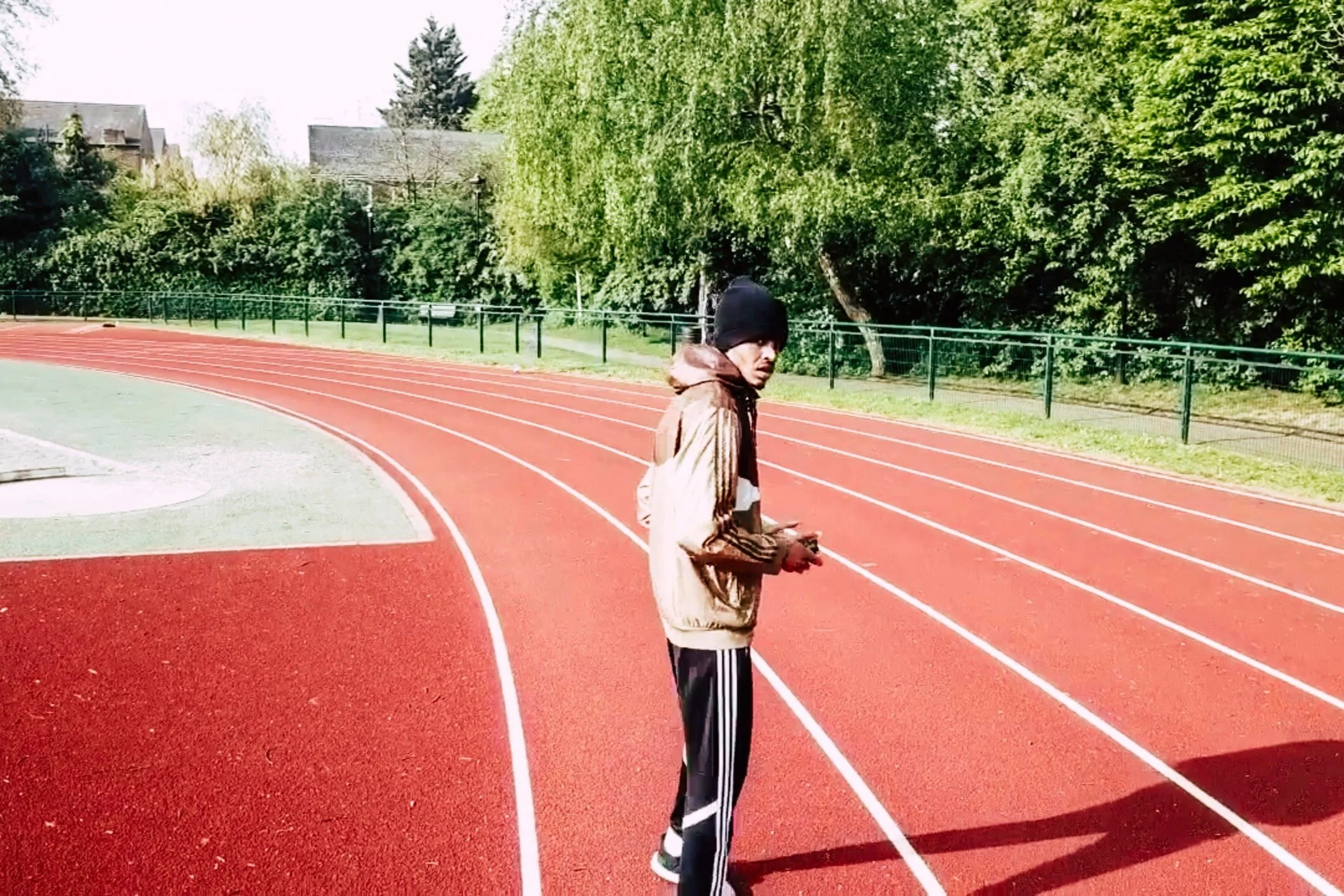
Completed as part of a marketing strategy this project titled ‘This Is The Future’ is a short motion picture directed by myself in collaboration with Adidas Motorsport which captures and summarises a visual profile of my ongoing racing career, thus-far and key attributes relating to the great involvement of athleticism often missed by those outside of the sport. This montage also works as a key to introducing my adopted tagline “this is the future” created as an additional marketing strategy that implies to all future partners that my brand is the future. This is to be used on all things pertaining to my racing career.
Targeted at predominantly sponsors and partnering investors towards my racing brand, this project was also executed as an expression of creative nature, utilising skills and knowledge in motion graphics and equally provided the perfect platform to develop and use consistent brand artwork ranging from typefaces to set colour codes and icons.
ALMIGHTY ONE
The Almighty One project was produced as a promotional video for clients ‘Almighty One Clothing. Completed in 2018 this project was in efforts to best showcase the first official season of their clothing range, in addition to being used for digital and social outputs of the client. It presented itself as an opportunity to be an artistic experiment, with motion picture as the media, telling a story and setting an impression to the consumer of what kind of streetwear brand it is and lifestyle it revolves around.
Shooting, co-directing and editing the video, this allowed me to further develop a favoured style of mine which explores scenery and setting of both urbanized and natural environments along with a variation of digital factors including changes in lighting and camera exposure, most of which worked perfectly in creating a glitched effect and exaggerating key areas such as the clothing and models used.
CBI ANNUAL CONFERENCE
In collaboration with The Confederation of British Industry came the creation of the main stage design for their Annual Conference event. Produced in late 2018, this project was to use the branding already created for this event working with motion graphics and LED displays for what is the clients annual flagship event attracting over 1500 guests throughout the UK’s business and political sector. With the display measuring at over 60 x 25 ft in scale this project proved to be exciting as it was something of a challenge having never done something of its kind prior to this opportunity.
Having already collaborated with the CBI on previous branding for a range of events, this project was most anticipated as the exposure it would receive was a new experience; being featured on air with BBC News and key Business and political leaders. This project was not as experimental due restricted brand guidelines of the CBI but remains an enjoyable strong success measured in its outcome.
RECOGNITION
As part of a final year university project and commemorative installation this project named ‘Recognition’ was a mural artwork done for clients St George’s RC school, OFSTED and Westminster Schools. Produced in 2016, this project was inspired by the love for street art, typography and architecture, with the title and letterform composition spelling words collected from students attending the school on how they best felt about the schools recent ‘Outstanding’ level achievement awarded from OFSTED. As an opportunity for creativity; specifically a personal favourite of mine being lettering and type this work was thoroughly enjoyed and appreciated by myself and schooling community alike with its fair share of onlooking curiosity and letterform deciphering.
An opportunity to further my knowledge on letters and typography in addition to experiment with this form of visual communication, this production was the executed using a range of mark- making techniques and styles. The colour palette was also a mindfully selected process as I purposely took into consideration the interiors and tailored it to fit with the immediate scenery of the room and through this; the piece entirely both illuminates the setting but blends in .
3T CLOTHING LAUNCH PARTY
Approached by streetwear clothing brand ‘To The Top (3T)’ this combination of artwork was produced as a props for the clients official Launch party. Completed in 2015 this project was influenced and produced in a style that reflects the brands message and image being sub-culture, urbanisation and the UK Grime music scene. This was reflected through the usage of temporarily chipboard surfaces to work on as opposed to expensive material and graffiti art as the method of production.
With the colour selection being bold hues of Red, Black, White and grey these were purposely chosen as I intended the artwork to stand out and be eye catching particularly as they were to be string up in a dark environment under artificial strobe lights. Florescent paint was also used for addition effects which worked successfully as the brand logo appeared particularly distinctive in the outcome.


